

 GitHub
Receba novidades do Hedhog no seu e-mail
Novos lançamentos, receitas e breaking changes — sem spam.
Temas
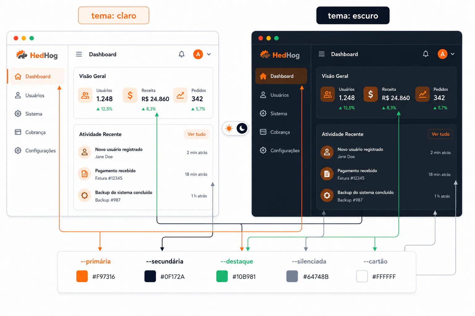
O painel de administração do Hedhog é totalmente personalizável via configurações — cores, logo, favicon, nome do app e tipografia — sem necessidade de rebuild. Esta é uma das receitas mais completamente implementadas do Hedhog: toda configuração abaixo é real, ligada a apps/admin/src/components/provider/theme-provider.tsx, e tem efeito imediato.
No admin, tudo isso fica em Settings → Configurations → Appearance — não há um grupo literalmente chamado "Theme", embora toda chave de configuração abaixo tenha o prefixo theme-.
Status: ✅ Totalmente implementado — toda configuração abaixo é real e tem efeito no próximo carregamento da página.
Configuração Rápida
- Vá em Settings → Configurations → Appearance
- Defina
theme-primary-lightetheme-primary-dark(e os outros pares de cores) para as cores hexadecimais da sua marca - Faça upload do seu logo/favicon via Armazenamento de Arquivos, depois cole as URLs resultantes em
image-url/icon-url - Faça um hard-refresh no admin e confirme que as novas cores e o logo realmente aparecem
Como Funciona
- As configurações de tema são armazenadas como linhas na tabela
setting, sob o grupo de configuração Appearance - No carregamento, o
ThemeProviderdo admin as lê (com cache emlocalStoragesob a chavesettings) e injeta um bloco<style>diretamente no documento — cada configuração de cor se torna uma propriedade CSS customizada como--primary, escrita como!importantpara sobrescrever os padrões do Tailwind - As cores são aplicadas como strings hex brutas, não convertidas para HSL — se um valor não for uma string
#rrggbbválida, essa regra é silenciosamente ignorada e o padrão do Tailwind aparece no lugar - O Hedhog rastreia as variantes clara e escura de toda cor de forma independente — não há uma única cor de origem que seja auto-escurecida; você define ambas explicitamente
theme-modecontrola claro/escuro/sistema, e uma sobreposição por usuário é armazenada no lado do cliente emlocalStoragesobtheme— então um usuário individual pode alternar para o modo escuro sem mudar o padrão do sistema para todos os outros
Configurações de Cor
Toda cor abaixo existe duas vezes — uma com sufixo -light e outra com sufixo -dark — em Settings → Configurations → Appearance. O Hedhog não gera uma a partir da outra; se você definir apenas a variante clara, o modo escuro recorre aos padrões do Tailwind para aquele token.
| Variável CSS | Chave de config claro | Chave de config escuro | O que ela controla |
|---|---|---|---|
--primary | theme-primary-light | theme-primary-dark | Botões, links, estados ativos, anéis de foco |
--primary-foreground | theme-primary-foreground-light | theme-primary-foreground-dark | Texto/ícones sobre fundos com a cor primária |
--secondary | theme-secondary-light | theme-secondary-dark | Botões secundários, acentos sutis |
--secondary-foreground | theme-secondary-foreground-light | theme-secondary-foreground-dark | Texto sobre fundos secundários |
--accent | theme-accent-light | theme-accent-dark | Acentos de hover/interativos |
--accent-foreground | theme-accent-foreground-light | theme-accent-foreground-dark | Texto sobre fundos de acento |
--muted | theme-muted-light | theme-muted-dark | Estados desabilitados, fundos sutis |
--muted-foreground | theme-muted-foreground-light | theme-muted-foreground-dark | Texto secundário/atenuado |
--background | theme-background-light | theme-background-dark | Fundo da página |
--background-foreground | theme-background-foreground-light | theme-background-foreground-dark | Texto padrão do corpo |
--card | theme-card-light | theme-card-dark | Superfícies de card/painel |
--card-foreground | theme-card-foreground-light | theme-card-foreground-dark | Texto sobre cards |
Todos os valores precisam ser hex de 6 dígitos (#1e40af), sem canal alfa. --primary-light também é reutilizada para --bprogress-color (a barra de carregamento no topo da página), então a cor da sua marca aparece lá também, sem uma configuração separada.
Modo e Tipografia
| Chave de configuração | Descrição |
|---|---|
theme-mode | Padrão do sistema: light, dark ou system. Usuários individuais podem sobrescrever isto localmente sem mudar para os demais |
theme-radius | Raio de borda em rem aplicado via variável CSS, afeta botões/cards/inputs globalmente |
theme-font | Pilha de font-family CSS (padrão ui-sans-serif, system-ui, sans-serif) |
theme-text-size | Fator de escala global de texto |
Marca
| Chave de configuração | Descrição |
|---|---|
image-url | Logo mostrado na estrutura do admin |
icon-url | Favicon |
system-name | Nome da aplicação mostrado no título do navegador e na barra lateral |
system-slogan | Slogan mostrado ao lado do nome |
menu-width | Largura da barra lateral em rem |
Estes são consumidos diretamente pelos componentes de estrutura/layout do admin, e não pela lógica de injeção de CSS do ThemeProvider — fazer upload de novos arquivos para image-url/icon-url funciona da mesma forma que qualquer outro upload de arquivo (veja Armazenamento de Arquivos): faça o upload primeiro, depois cole a URL resultante na configuração.
Aplicando Mudanças
Salvar qualquer configuração em Settings → Configurations → Appearance tem efeito no próximo carregamento de página para aquele navegador, já que o ThemeProvider lê das configurações em cache no localStorage e as reaplica via um useEffect na montagem, não via um push ao vivo por socket. Se um colega de equipe não vê sua mudança, diga a ele para fazer um hard-refresh em vez de presumir que a configuração não foi salva.
Verifique se Funcionou
- Faça um hard-refresh no admin após salvar uma cor e confirme que a nova cor realmente aparece — não apenas que a configuração foi salva com sucesso
- Alterne o modo escuro e confirme que as variantes
-darktambém aparecem, em vez de recorrer aos padrões do Tailwind
Solução de Problemas
| Sintoma | Causa provável |
|---|---|
| Uma configuração de cor não tem efeito visível | O valor não é uma string hex #rrggbb válida — a regra é descartada silenciosamente, sem um erro |
| O modo escuro parece sem marca mesmo com o modo claro estilizado corretamente | Você definiu apenas a variante -light daquela cor — defina sua contraparte -dark explicitamente |
| O usuário não consegue sair de uma preferência clara/escura travada | A sobreposição local dele vive em localStorage sob theme (e theme-source) no seu próprio navegador — limpar os dados do site a redefine para o padrão do sistema |
| O logo/favicon não atualiza após fazer upload de um novo arquivo | A configuração ainda aponta para a URL do arquivo antigo — cole novamente a nova URL enviada em image-url/icon-url |